Competitive Research
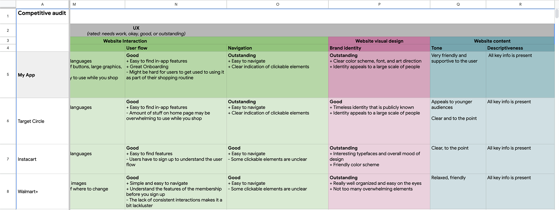
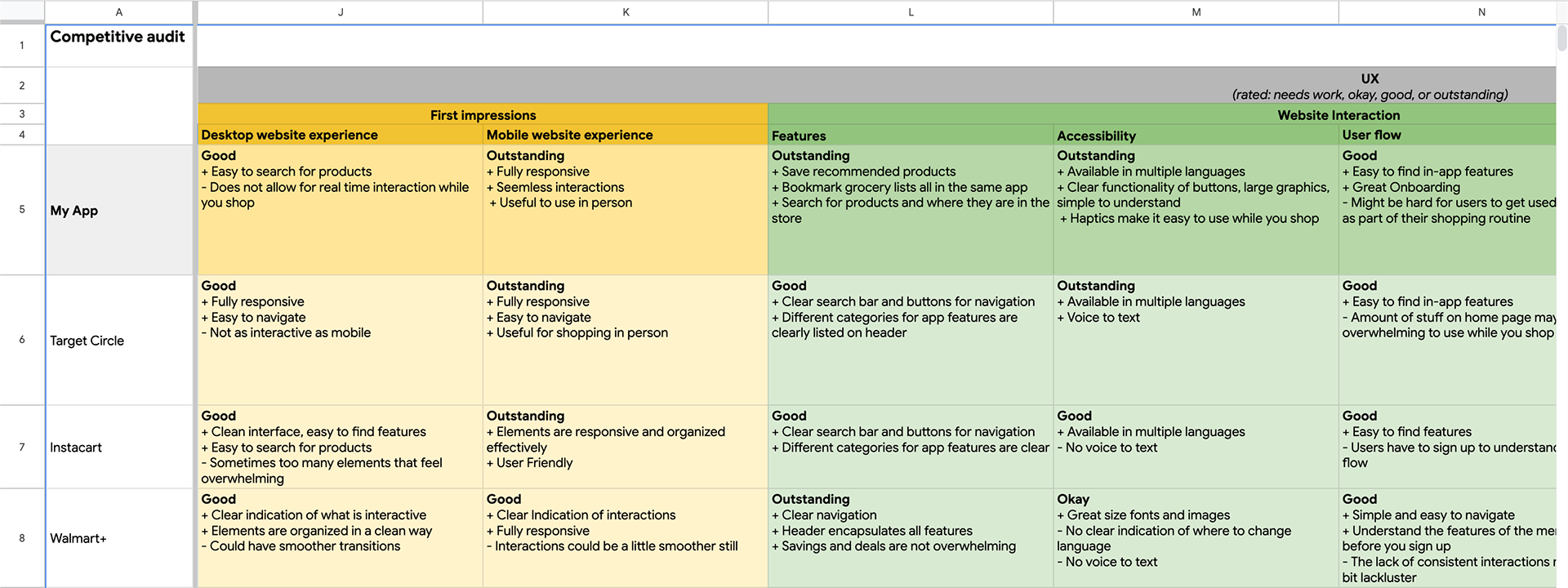
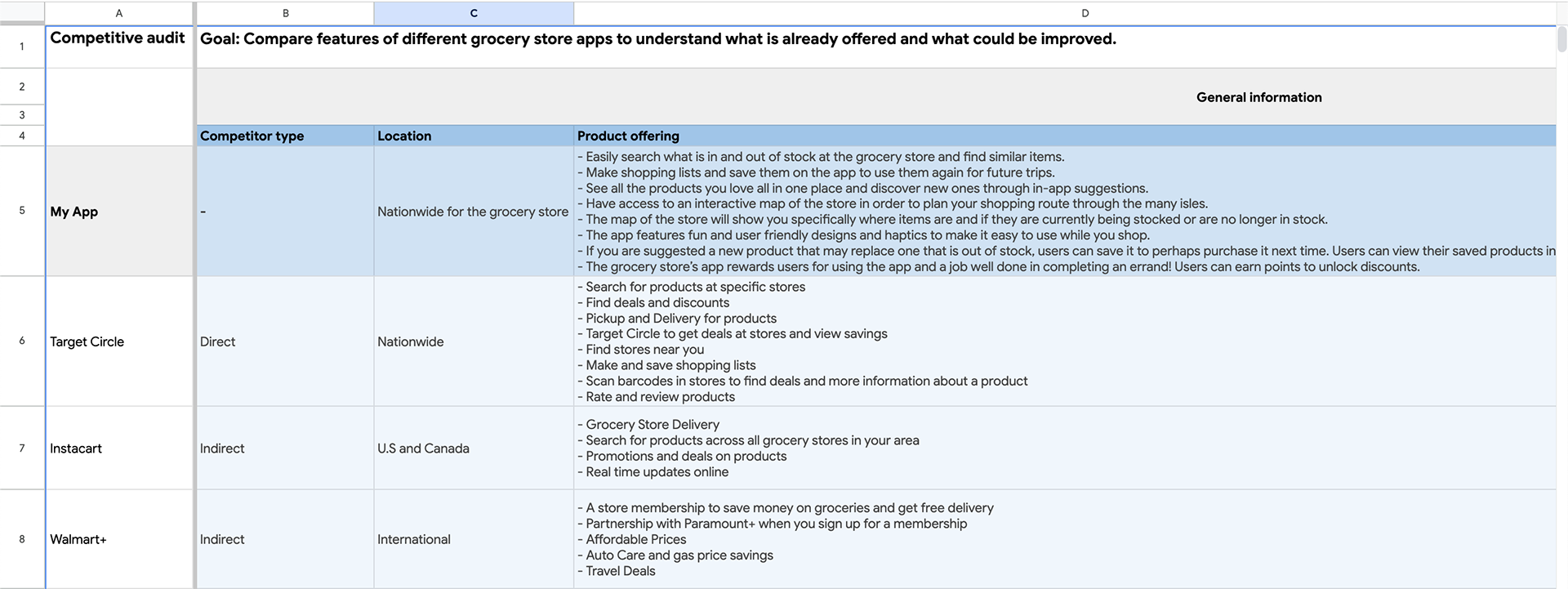
The competitive audit was organized through a spreadsheet analyzing the offerings of each competitor as well as the UX design of their products. From my audit, I was able to identify how my product can stand out from the rest and address what competitors are greatly missing.
Here's some screenshots that provide brief synopsis of what the research entailed!
User Personas AND Identifying Pain Points
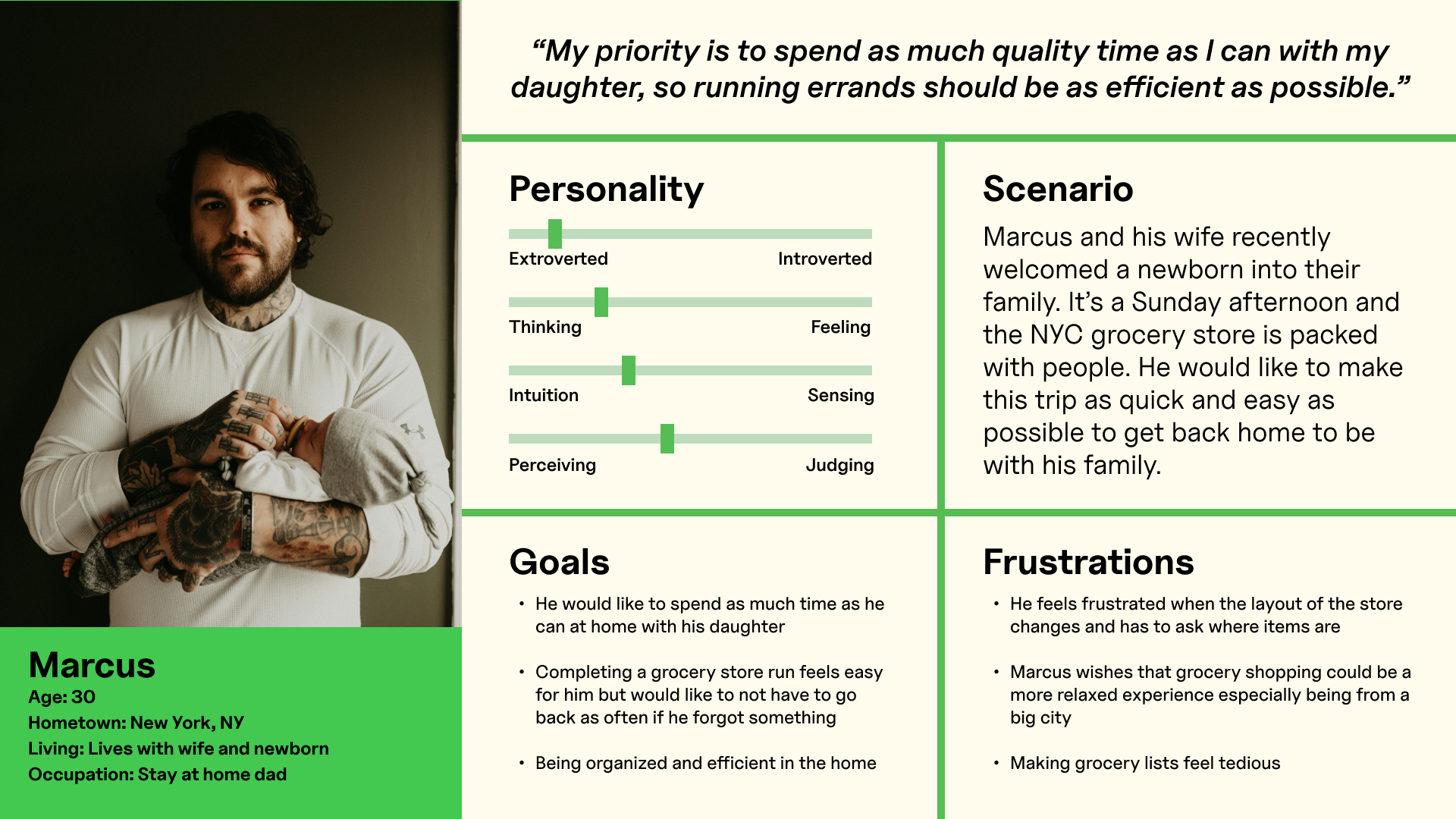
Through my research, I was able to identify three main user pain points that could be improved through my app:
#1: Many shoppers find it overwhelming and tedious to go grocery shopping due to crowded stores or having other responsibilities in mind such as children.
#2: Sometimes stores tend to change their stock or overall layout of the store. It can be frustrating sometimes finding everything one might need or finding a replacement item.
#3: Making groceries lists can be unreliable because users cannot see what is available ahead of time. It would be better to have all these features in one place.
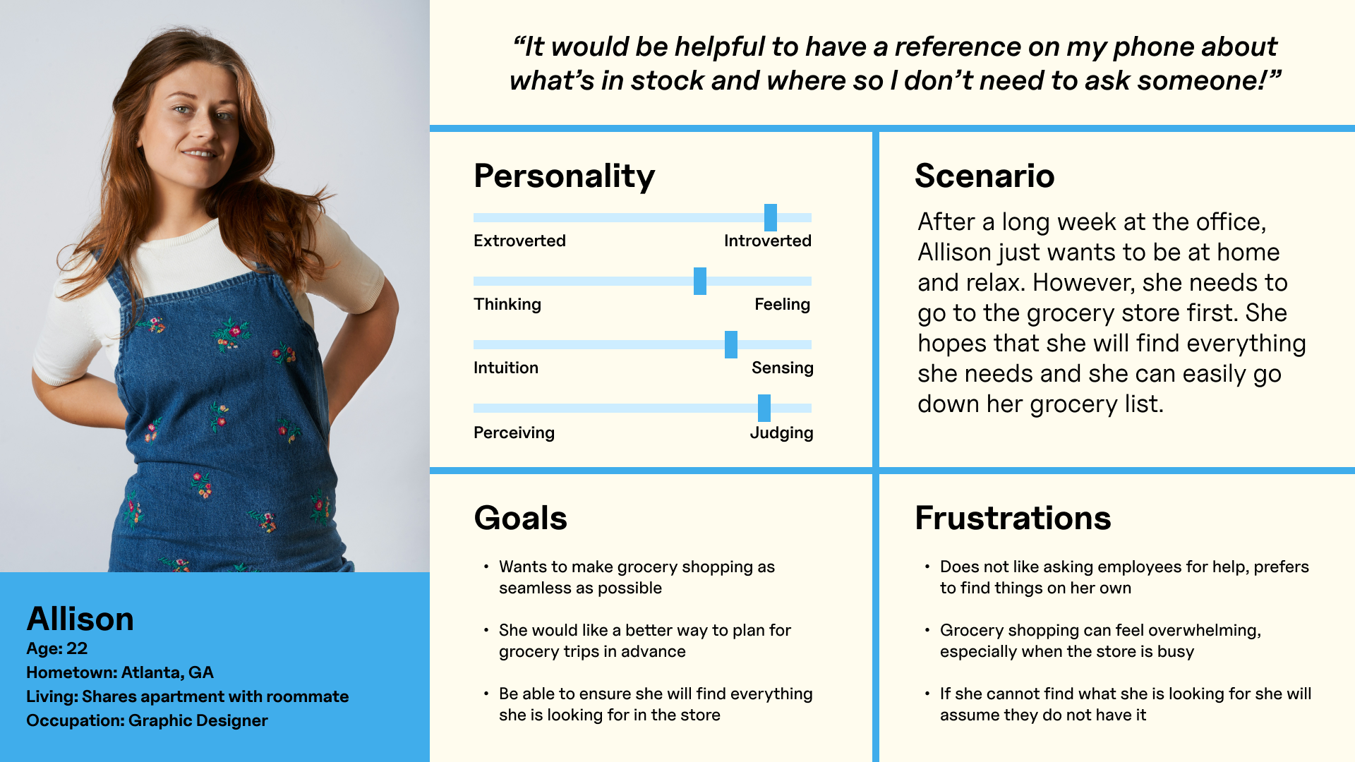
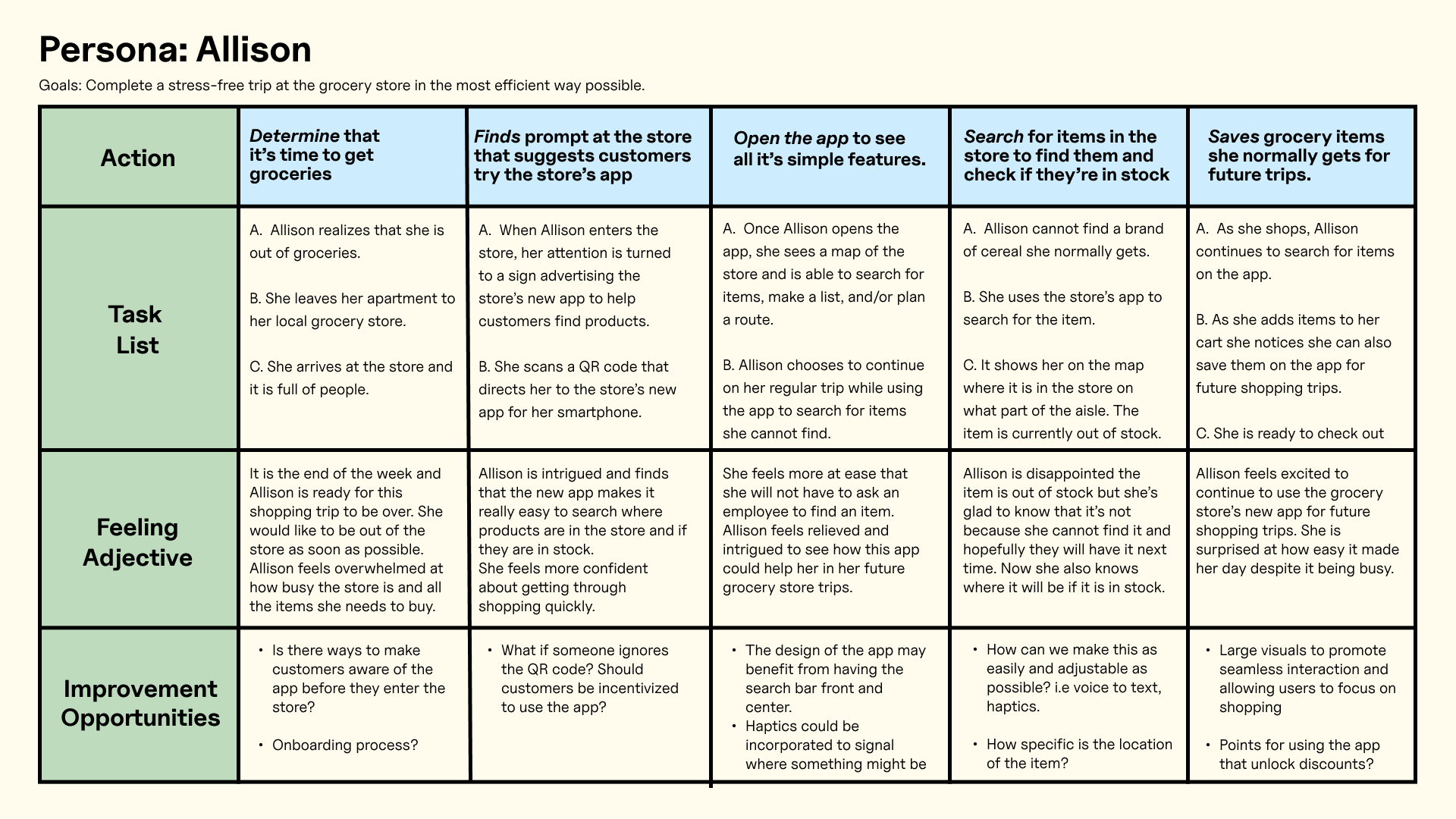
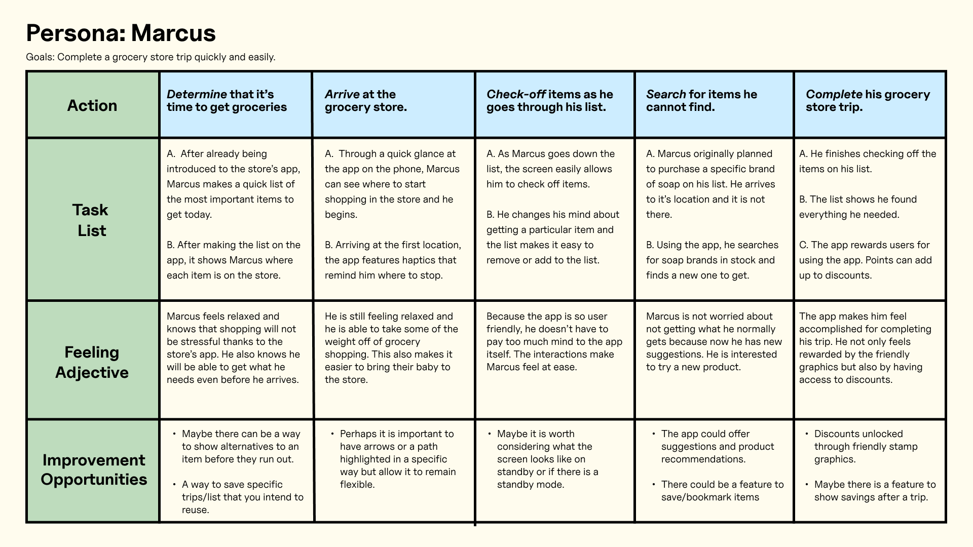
After Identifying these pain points, it was helpful to create these user personas to understand the user and their needs better. Additionally, I took it a step further by creating empathy maps.
Starting the design process
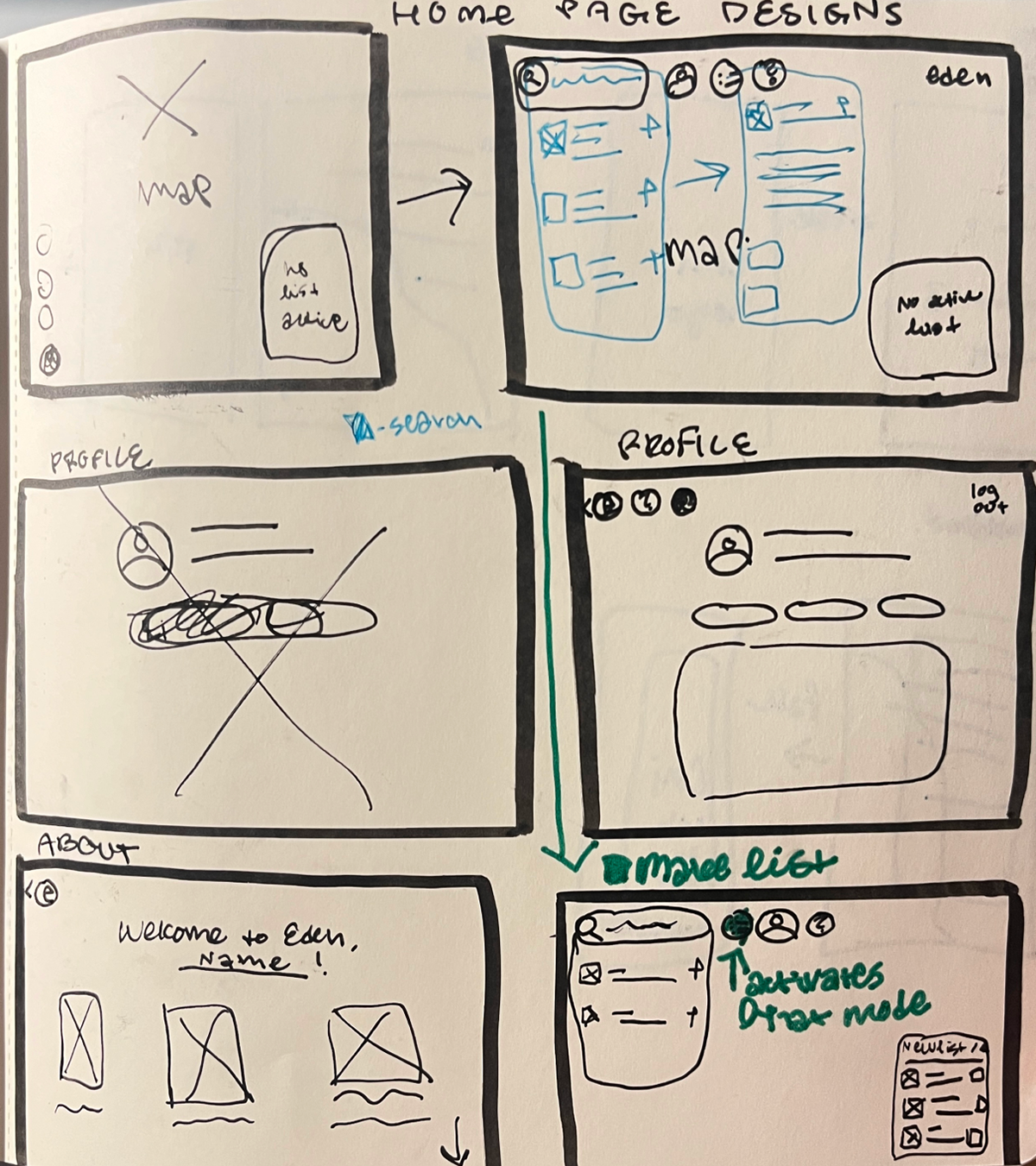
As I began to plan out my product, it was important for me to go through different iterations of hand drawn wireframes, digital wireframes, low fidelity prototypes, and usability studies. Here are some photos of that process!
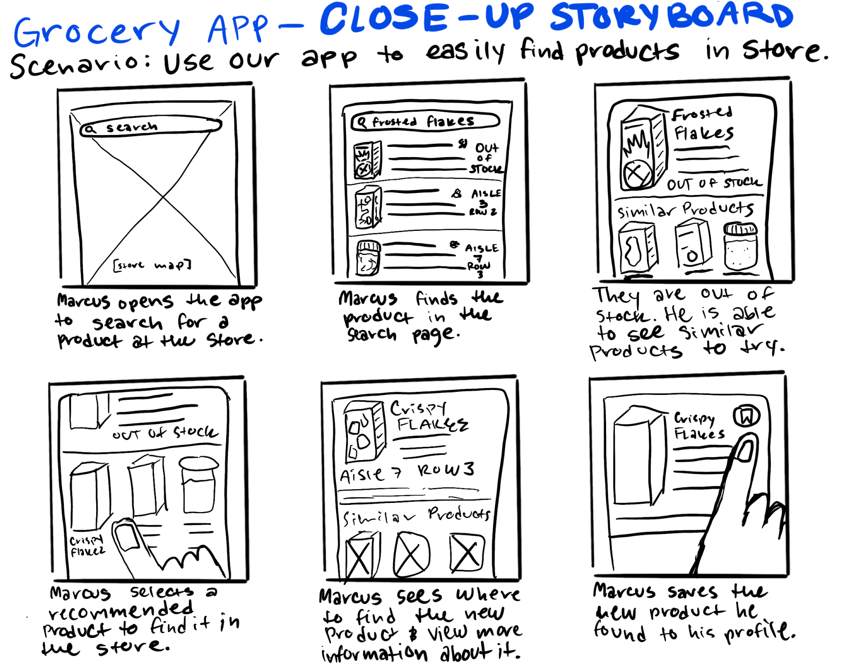
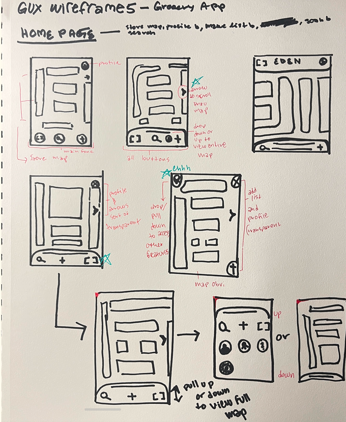
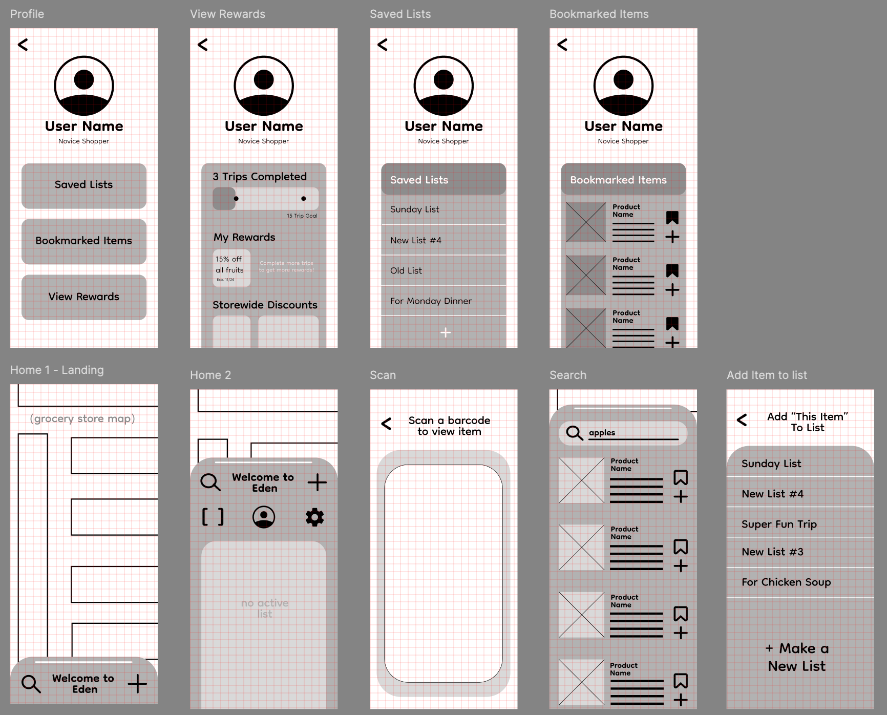
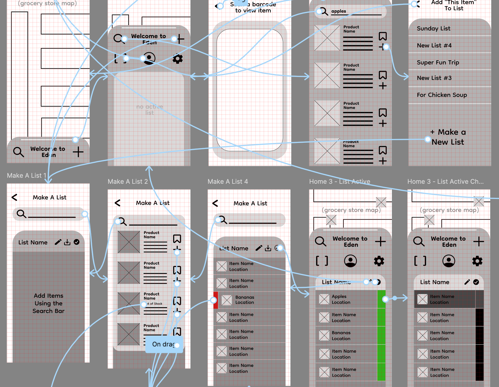
Usability Study
After creating my low fidelity design, I planned and executed my own research study for my app. Below are some findings based on the tests I made with the help of friends and family!
Research plan summary
Research Goals:
- Is a user able to understand the basic functions of the app?
- Do users understand how to search for products on the app and find them in person?
- Is the user able to make and activate a grocery list?
- Can the user check off items on the grocery list and delete them if needed?
- Can the user complete a successful shopping trip?
Key Performance Indicators:
Time spent completing a task and user error rates.
Time spent completing a task and user error rates.
Methodology:
Data will be measured by observing users navigating through the prototype and asking them to complete specific tasks on the app. First users will receive a brief introduction of the app, then they will complete the tasks moderated by me.
Data will be measured by observing users navigating through the prototype and asking them to complete specific tasks on the app. First users will receive a brief introduction of the app, then they will complete the tasks moderated by me.
my research findings
1. Originally, the mechanism to check off items on a list was a swipe to the left. Users could also delete items by swiping to the right. This action was overall not very intuitive and I decided to use check boxes instead in of swiping in my final design.2. The use of the plus sign to add a list did not express a clear function to some users. I made a plan to change this icon to show a more obvious function.
3. Some users highlighted how beneficial it would be to add an onboarding process for new users.
4. Overall there was a positive reaction to the app’s offerings and users felt that it could become very useful to their shopping experience.
The Final Product
Throughout the design process, visuals are always my favorite part. I was excited to bring the functionality to life through high fidelity designs. Below are videos of the final prototypes.
Onboarding Prototype:
Full App Experience Prototype:
Desktop Experience Prototype:
Final Thoughts
Thank you so much for taking the time to look through my case study! I am so grateful to have had the opportunity to complete the Google UX certification and I learned a lot about everything that goes into the UX design process. It was interesting to also see the need for an app like this in the real world. I am so intrigued by how as designers we can make technology work for us and make our lives easier.